We had thought for a long time that the name SilkMotion was not the right image for our company. So when ownership of the company changed, we set out on a renaming journey. Four months later we emerged as Rapid Eye Digital.
Lots of thought and research went into our name. On the surface we wanted something that sounded young, energetic, hip, and a little dark. We tested our name against available domains and company listings. Acronyms were an important part of our process as well.
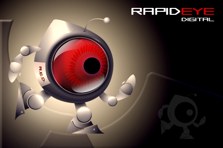
Rapid Eye Digital has several symbolic meanings for us. First, rapid eye movement is associated with a dream state of the body and a moment of ultimate creativity. Rapid eye also relates to the interpretation of multiple frames being played in order that allows us to understand animation. On a more basic level, rapid refers to our commitment to deliver quality work in an efficient manner. Eye reinforces our production of visual communication. Digital simply clarifies that our work is done all digitally using the latest technology.
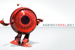
Finally, R.E.D. is the acronym for our company. This relates to the very popular RED HD video camera. It also became the name for our logo and mascot (discussed in our next blog).
Please visit our new website at www.rapideyedigital.com.


 Facebook
 Twitter
 YouTube